

EATALY
Project: Eataly Pop Po for Responsive Website
Case Study
My Role: UX Designer Lead
(Ideation, Research, Contextual Inquiry, Wireframing, User Flows, Information Architecture, Mockups, Graphic Design, Prototype, Usability Testing, and Presentation.)
BUSINESS OBJECTIVE
Users need to have e-commerce easy to navigate, with reviews section, discount purchase, shipping benefits and recommendation feature in Etaly.com, because user enjoys buying online, get a discount and quick checkout. The business of this project was to restructure the information architecture of the existing e-commerce site and created a season Pop pop only with 100 items with the Spring-themed.
Process.-
SOLUTION
Optimized website to promoting new brands, products, increase sales and traffic, using the best practice items selections, purchase discount and quick checkout. Easy to use for the users when they navigate through the website.
Business Overview.-

Eataly is the largest Italian marketplace (food hall) in the world, comprising a variety of restaurants, food and beverage counters, a bakery, retail items, and a cooking school. Eataly was founded by Oscar Farinetti, an entrepreneur formerly involved in the consumer electronics business, and collaborates with Slow Food.
Research & Feature Prioritization._
The research process base on comparative and competitive, contextual inquiry and feature prioritization determined the MVP. Have keeping mind the business goals and users goals to get the best data.
Information Architecture._
The information architecture in this project was base on card sort process, I conducted 4 rounds open card sorting and 3 rounds of closed card sorting to determinate the best navigation structure on the site. My best practice was observing my 4 users, and how they organize the products by category, others user deciding to organize by kind of items. When I moved to a closed card sort, I observed of 3 of my 4 users organizing the products exactly the same category.
Afte my card sort process, I created the site map based on the final result of my card sort process. Now I create a navigation menu and user flow.

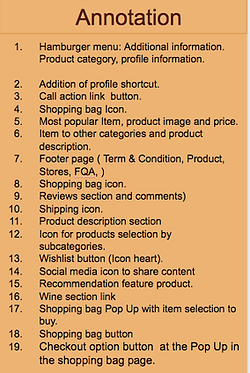
Wireframe


LOW FIDELITY
Block Wireframe
MID FIDELITY
Wireframe
HI FIDELITY
Mockup

Usability Result


Summary

I created a full mockup, applying the Eataly color palette and following the brand guideline. This case study was a short-time project but very beneficial in my UX learning process.
Short-term next steps:
-
Conduct another round of user testing and implement results
-
Add “Buy in one Click Button”
-
Improve surprise and delight element
Conceptual next steps:
-
Shipping Benefits
-
Integrate reviews by product and category
-
Redesign the website
-
Expand Rewards Points system